Game Screen and HUD
Lay out the client's fixed HUD on a 1:1 replica - stat orbs, minimap buttons, tab bar and background art - and what lands in map_area_config.json.
7 min read
What Game Screen mode is#
The client draws a fixed heads-up display around the 3D view: a minimap in the top-right with stat orbs down its left edge, a tab area beneath it, and a chat box along the bottom. Game Screen mode in the GUI Editor is a replica of that layout at the exact size players see it. Everything you change here is saved as you edit and redrawn on the replica immediately, so the preview is the game.
Use Game Screen mode to:
- Choose which player stats show as orbs beside the minimap, and their colors and icons.
- Add up to two action buttons under the minimap.
- Replace the background art behind the minimap and tab area.
- Arrange the side tabs (covered in detail on Tabs).
Opening Game Screen mode#
- Click GUI Editor in the top bar.
- In the main menu's Game Settings column, click the Game Screen Editor card.
A tab named Game Screen Editor opens. The window rearranges itself: the left panel's header changes to Tab Configuration, the right panel's header changes to Map Area, and the center shows the replica under a Game Screen heading. Only one Game Screen Editor tab can be open; clicking the card again focuses it.
The replica#
The canvas is 900 x 600 pixels, which is the client's compact layout at 1:1:
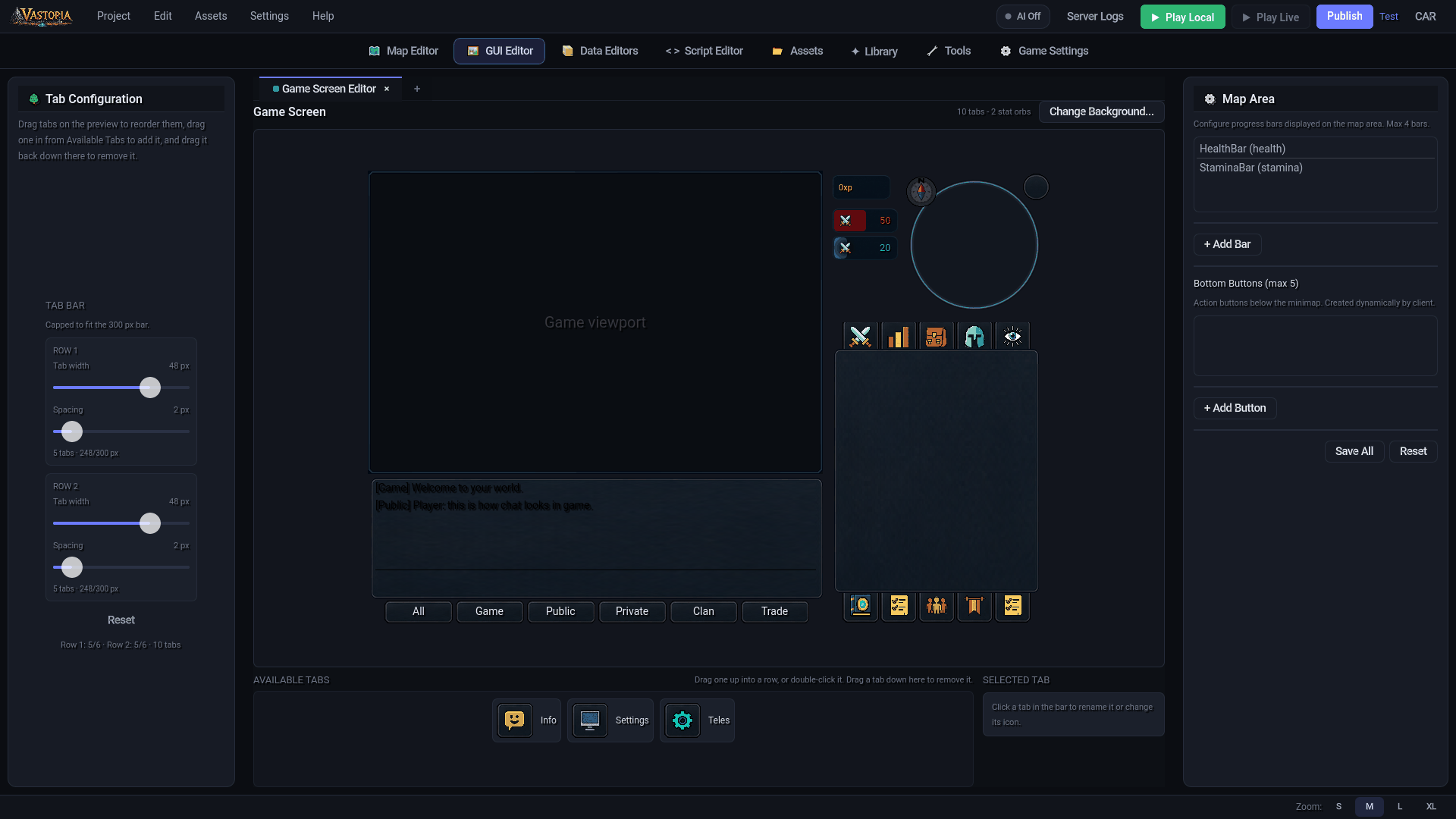
| Region | Position and size | What the client draws there |
|---|---|---|
| Game viewport | Top-left, 600 x 400 | The 3D world. The replica shows a dark placeholder and the client's frame art. |
| Minimap | Top-right, 300 x 200 | The circular minimap with its ring, compass, the corner button, the XP counter, stat orbs and the two bottom buttons. |
| Tab area | Bottom-right, 300 x 400 | Two rows of tab buttons with the selected tab's panel between them. |
| Chat | Bottom-left, 600 x 200 | The chat frame, sample messages and the channel buttons (All, Game, Public, Private, Clan, Trade). |
The replica is a picture; nothing on it is clickable except the tab bar. Editing happens in the side panels. The header above it shows a summary such as 8 tabs - 2 stat orbs and the two background buttons described below.
Art comes from the project's own assets/images/UI/ when present, otherwise from copies of the client's stock art bundled with the editor, so a re-skinned game previews its own look.
Stat orbs#
The client draws each configured stat as a pill-shaped orb, 87 x 32 pixels, stacked down the minimap's left edge starting below the XP counter with a 4 px gap. Each orb shows a 16 px icon on the left over a soft glow, a half-opacity fill in the orb's color, and the current value on the right. Positions are computed by the client; you cannot move an orb.
Adding and editing orbs#
The Map Area panel on the right starts with the text "Configure progress bars displayed on the map area. Max 4 bars." and a list of orbs in the form Name (stat_key).
- Click + Add Bar. A new orb is created for the first stat that is not already shown. The button is disabled once four orbs exist.
- Select the orb in the list to reveal its properties.
- Edit the fields:
| Field | What it does |
|---|---|
| Name | The node name the client gives the orb. Keep it unique. |
| Stat Key | Which stat the orb represents: health, stamina, mana or energy. |
| Fill Color | The fill and value-text color. |
| Icon | A PNG from the project's sprites. Drop an image on the preview box, click Browse... to pick one from the asset library (which also offers Import from file...), or click X to clear it. Imported icons are added to the asset library under assets/sprites/. |
- Click Remove Bar to delete the selected orb.
Every change is saved immediately. A new project ships with a HealthBar (red, default 50) and a StaminaBar (teal, default 20); Reset at the bottom of the panel returns to exactly that pair and clears the bottom buttons.
Icons larger than 16 px are resampled to exactly 16 x 16 without preserving aspect ratio (smaller ones are drawn at their own size and never upscaled), so square source images look best.
Bottom buttons#
Two action buttons can sit below the minimap circle, one on each lower diagonal, on the client's 35 x 35 button art. The Bottom Buttons section of the Map Area panel manages them:
- Click + Add Button. It is disabled once two buttons exist; the client only draws two and logs a complaint about any extra.
- Select the button in the list (
Name (action_key)) and edit:
| Field | What it does |
|---|---|
| Name | The button's node name. New buttons are named Button1, Button2. |
| Action Key | An identifier stored with the button (action1, action2 by default). |
| Icon | Browse... picks from the asset library, Import... loads an image from disk, Clear removes it. The icon is drawn inside a 21 px box centered on the button, aspect preserved. |
- Click Remove Button to delete it.
Background art#
The backdrop behind the whole replica is the client's background_complete.png. Replacing it re-skins the minimap and tab area in one step.
- Click Change Background... in the header above the replica, or drag an image file from your file manager onto the replica.
- Pick a PNG, JPG or WebP. Images that are not 900 x 600 are resized to exactly that size, without preserving aspect ratio.
The editor saves the full image to assets/branding/background_complete.png and crops the pieces the client actually loads into assets/images/UI/:
| File | Crop | Used for |
|---|---|---|
map_bg.png | Top-right 300 x 200 | Minimap background |
background.png | Bottom-right 300 x 400 | Tab area background |
background_complete.png | Full 900 x 600 | The complete backdrop |
Reset BG appears while an override is active and deletes assets/branding/background_complete.png, restoring the stock art on the replica. The cropped files under assets/images/UI/ are left in place.
The tab bar#
The tab bar on the replica is live: drag tabs to reorder them, drag new ones in from the Available Tabs tray beneath the replica, and use the Tab Configuration panel on the left for per-row width and spacing. Clicking a tab opens its panel in the replica's tab area exactly as it will appear in game. The full procedure and the tab_config.json format are on Tabs.
Saving#
Orb, button and tab edits are written to disk as you make them. Save All at the bottom of the Map Area panel re-saves both the tab configuration and the map area configuration for reassurance; there is nothing to lose by switching tabs.
map_area_config.json reference#
Saved to assets/data/map_area_config.json and read by the client at startup.
{
	"version": 1,
	"progress_bars": [
		{
			"name": "HealthBar",
			"stat_key": "health",
			"icon": "1.png",
			"fill_color": [1.0, 0.0, 0.0, 1.0],
			"default_value": 50.0
		}
	],
	"bottom_buttons": [
		{
			"name": "Button1",
			"action_key": "action1",
			"icon": ""
		}
	]
}
progress_bars entries#
| Field | Type | Default | Notes |
|---|---|---|---|
name | string | HealthBar, StaminaBar, ManaBar, EnergyBar per stat | Node name in the client. |
stat_key | string | — | One of health, stamina, mana, energy. |
icon | string | 1.png | File name inside assets/sprites/. Empty means no icon. |
fill_color | array of 4 floats | per stat | RGBA in the 0 to 1 range. |
default_value | number | 50, 20, 80, 60 per stat | Initial fill, 0 to 100. |
At most four entries are written. The client reads exactly these five fields; older editor versions also wrote position, size, fill_mode, corner_radius, background_color and border_color, all of which the client ignores and the editor no longer writes.
bottom_buttons entries#
| Field | Type | Default | Notes |
|---|---|---|---|
name | string | Button1, Button2 | Node name in the client. |
action_key | string | action1, action2 | Stored on the button; not yet acted on by the client. |
icon | string | "" | File name inside assets/sprites/. |
At most two entries are drawn. Positions are fixed by the client.